I’ve been trying really hard to resist talking politics on this site, so I thought I’d steer clear of hard issues a bit and just talk about something I know about. I just did a little research on the design and technical merits of George W Bush and John Kerry’s respective Web sites.
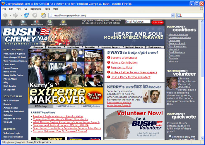
Take a look at the 2 screen shots below:
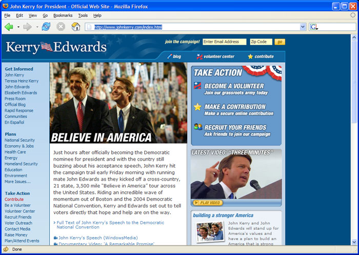
Kerry’s site has a calm and easygoing vibe about it. Not too much cluttter, the various areas of the site are clearly laid out and there is simple top navigation. I particularly like the “Take Action” box in the upper right. It has very clear instructions and is prominently displayed. The web site’s iconography is very friendly (although a little too close to Windows XP’s icon set) and helps contribute to the easygoing and friendly vibe. The site makes me feel “calm”, for lack of a better word.
Now, look at George’s site. What a cluttered mess. It looks like a bomb went off in a web design shop. Let’s just throw everything on the page! It’s strange that the first image I saw when going to Bush’s site is a big picture of Kerry. I also can spot 9 instances of the word “Kerry” on the page, and that’s only above the fold. To be fair, this is the day after the DNC Convention, so I’m sure Bush wants to quickly defuse any momentum they’re getting, but please. I thought Bush’s people were the one’s saying that Kerry is focusing too much on bashing Bush and not enough on espousing his own views. I guess they’re not practicing what they preach.
But, back to the design. Where am I supposed to look? What’s the page’s flow? Literally everything on the page screams for you to look at it. And what’s the deal with those tabs across the top of the page (Economy, Compassion, etc)? Those are the tiniest tabs I’ve seen in some time. They’re just shoved in between the header graphic and the rest of the page. It really shows how important these issues are to Bush (in comparison to, say, bashing Kerry). It reminds me of the time I was driving in Atlanta with my sister and we passed that huge church right off 75 near Paces Ferry Rd. You know, the really really big, enormous one that requires the 5 story parking deck? Anyway, my sister pointed out that the cross on top of this huge structure was about 6 feet tall — really tiny in comparison to the rest of the structure. My sister looked at it and said, “kinda shows you how much all of this has to do with God, huh?”
I should note the similarities between the left navigation of each site. It’s interesting how Bush’s says “Stay Informed” while Kerry’s says “Get Informed”. I don’t know which site came up with the navigation links first, so I don’t know who ripped off who. But, it’s clear that they’ve been checking out the competition. And the fact that both sites have an official blog just blows my mind.
Next, I went to take a look under the hood. Both sites utilize tables for the structure of the page. I really wasn’t expecting table-less CSS design, but it would have been cool. Oh well. I didn’t poke too much more into the code because frankly, it’s boring to do that, but I will say that Bush’s tables are the most overly complicated (right off the bat it’s nesting tables 3 deep) and I counted 36 font tags (to Kerry’s one) on the page. Kerry definitely wins in the utilization of CSS.
The real test came when I ran both pages through the w3c validator. Of course, neither site validates. But Bush’s site is the big loser when it comes to number of errors. Here are links to the validations:
John Kerry’s Site
George W. Bush’s Site
Number of errors:
Kerry: 28
Bush: 276
So, if good web design and coding is important to you, I think it’s pretty clear who you need to vote for this November.
that bush site is so National Enquirer. Very dignified. Sigh.
that bush site is so National Enquirer. Very dignified. Sigh.